Making Thematic Changes to GGPlots
changing_ggplot.RmdIntroduction
This vignette will discuss how to make tweaks to the theme/aesthetic of a ggplot object. Any questions that aren’t answered here have likely already been answered on StackOverflow, so please Google around. Note that there are often multiple ways to accomplish the same goal (e.g., create a title using the ggplot::ggtitle or ggplot::labs functions).
library(tidyverse)
library(colorspace)
library(patchwork)

load("../../data_clean/dataClean_sexByAgeByEmploymentStatusBlack_acs5_2015_2016_2017_2018_2019.rda")

# make a shorter name
dat <- dataClean_sexByAgeByEmploymentStatusBlack_acs5_2015_2016_2017_2018_2019 %>%
  select(NAME,estimate,moe,year,sex,ageGroup,employmentStatus)

head(dat)
#>    NAME estimate moe year  sex          ageGroup   employmentStatus
#> 1 Adair        0  13 2015 Male    16 to 64 years    In Armed Forces
#> 2 Adair        0  13 2015 Male    16 to 64 years           Employed
#> 3 Adair        2   3 2015 Male    16 to 64 years         Unemployed
#> 4 Adair        7   8 2015 Male    16 to 64 years Not in labor force
#> 5 Adair        0  13 2015 Male 65 years and over           Employed
#> 6 Adair        0  13 2015 Male 65 years and over         Unemployed
Setup
For the sake of illustration, we will be using the Sex by Age by Employment status for African Americans per Iowa county from 2015-2019 ACS data. We will start with some basic “default” ggplot objects that will be changed in the following sections.
# employment status by age group
barPlot <- dat %>%
  group_by(employmentStatus,ageGroup) %>%
  summarise(estimate = sum(estimate),
            moe = tidycensus::moe_sum(moe,estimate),.groups = "drop") %>%
  ggplot(aes(x = reorder(employmentStatus,estimate),y = estimate,fill = ageGroup)) +
  geom_bar(stat = "identity")

barPlot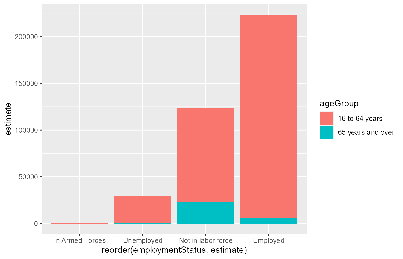
# number of individuals by employment status over time
timeSeriesPlot <-  dat %>%
  group_by(employmentStatus,year) %>%
  summarise(estimate = sum(estimate),
            moe = tidycensus::moe_sum(moe,estimate)) %>%
  ggplot(aes(x = year,y = estimate)) +
  geom_line(aes(colour = employmentStatus,linetype = employmentStatus)) +
  geom_ribbon(aes(ymin = estimate - moe,ymax = estimate + moe,
                  fill = employmentStatus),
              alpha = .2)

timeSeriesPlot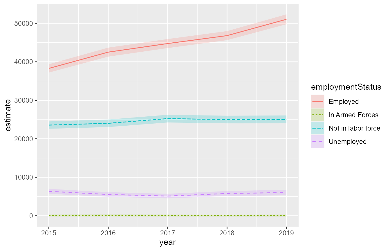
# percent not in labor force by county in 2019 -- flag estimates where C.V. > 30%
load("../../data_clean/dataClean_countyGeometry_acs5_2019.rda")
totals <- dat %>%
  filter(year == 2019) %>%
  group_by(NAME) %>%
  summarise(total = sum(estimate),
            total_moe = tidycensus::moe_sum(moe,estimate),.groups = "drop")

mapPlot <- dat %>%
  filter(year == 2019) %>%
  group_by(NAME,employmentStatus) %>%
  summarise(estimate = sum(estimate),
            moe = tidycensus::moe_sum(moe,estimate),.groups = "drop") %>%
  filter(employmentStatus == "Not in labor force") %>%
  left_join(totals,
            by = c("NAME")) %>%
  mutate(employmentPercent = estimate/total,
         employmentPercent_moe = tidycensus::moe_prop(num = estimate,denom = total,moe_num = moe,moe_denom = total_moe)) %>%
  mutate(cv = dspgWork::cv(estimate = employmentPercent,moe = employmentPercent_moe),
         cvFlag = dspgWork::flagCV(cv)) %>%
  mutate(pltLabel = paste0(NAME,"\n",
                           round(100*employmentPercent,2),"%",
                           ifelse(cvFlag,"*",""))) %>%
  left_join(dataClean_countyGeometry_acs5_2019 %>%
              mutate(NAME = dspgWork::cleanNAME(NAME)),
            by = "NAME") %>%
  ggplot(aes(geometry = geometry,fill = employmentPercent)) +
  geom_sf() +
  geom_sf_text(aes(label = pltLabel),
               size = 2,
               fun.geometry = sf::st_centroid) #plots labels at county centroid

mapPlot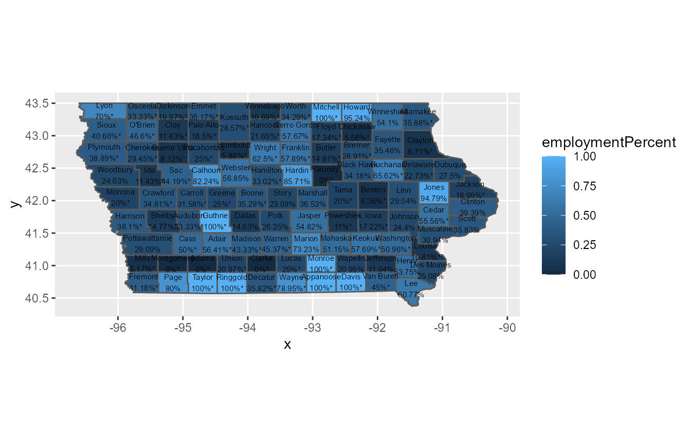
Colorscale
Below are the hex codes for the DHR colors.
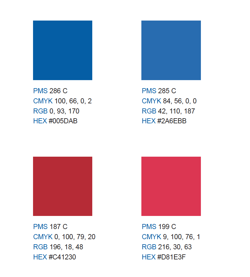
scale_*_gradient
If coloring by the value of a continuous variable (e.g., percentages), you may want to specify a colorscale that emphasizes large values. ggplot2’s default colorscale is a pretty hideous low = “darkblue”, high = “blue” scheme. If we want to emphasize large values of a continous variable, it often makes more sense to have low values blend in somewhat with the background of the plot to let high values stand out. In the case of the Iowa map plot created above, we can use the scale_fill_gradient function to change the color scale.
Note that you can also set the fill color for NA-valued estimates (of which there are none in these ACS data) and change the legend labels/breaks within these functions. The scales package has different label types.
mapPlot +
  scale_fill_gradient(low = "white",
                      high = "#D81E3F",
                      na.value = "grey50",
                      labels = scales::percent,
                      limits = c(0,1),
                      breaks = c(0,.25,.5,.75,1))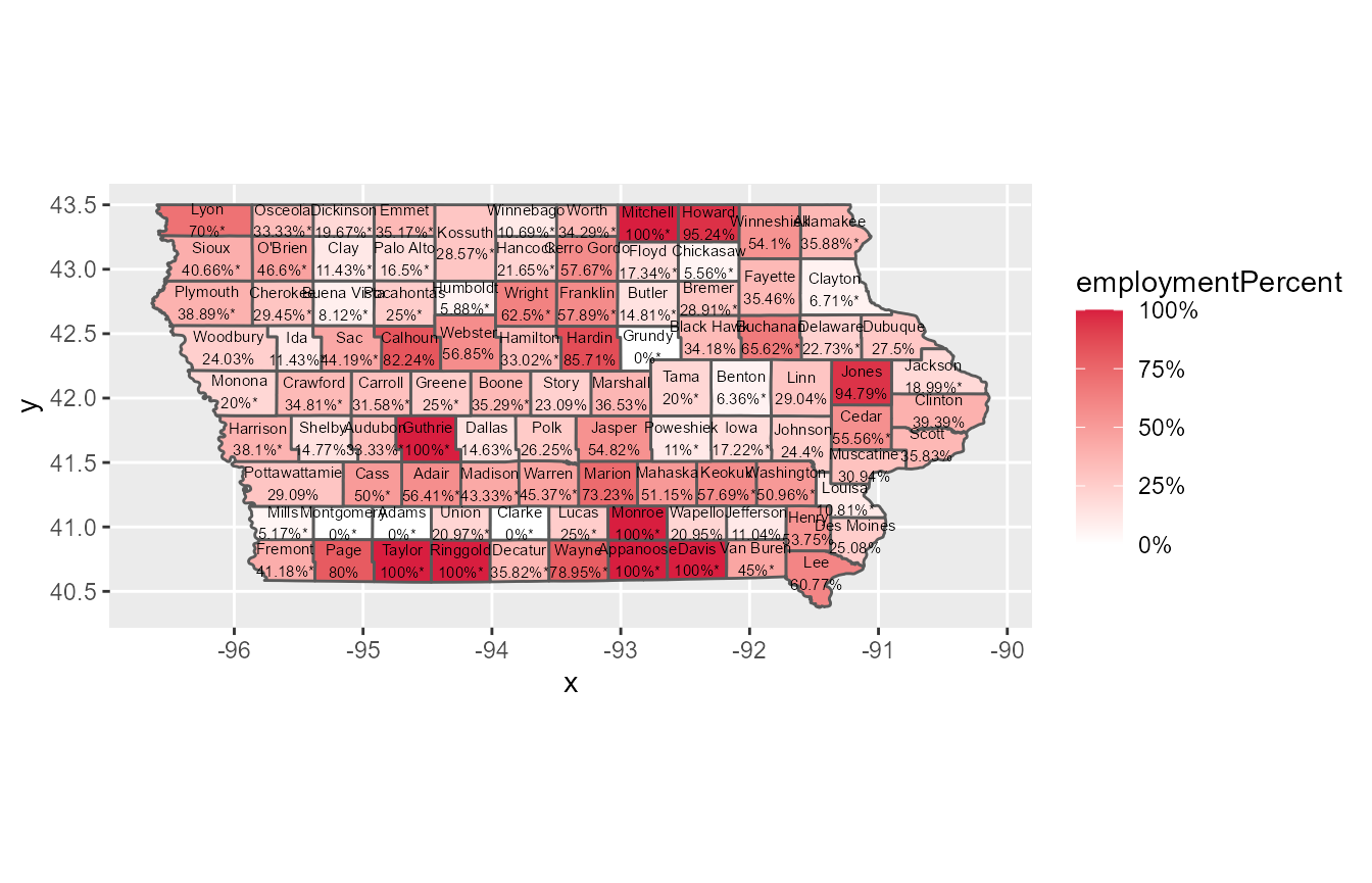
We may want a greater degree of control than just specifying the top and bottom ends of the colorscale. Say we wanted to compare each Iowa county to a baseline value; for example, the Iowa-wide (estimated) percentage of African Americans who are out of the labor force (which, based on the ACS data, is about 30.5%). We could use the scale_fill_gradient2 function to set a midpoint as well.
mapPlot +
  scale_fill_gradient2(low = "#2A6EBB",
                       mid = "white",
                       midpoint = .305,
                       high = "#D81E3F",
                       na.value = "grey50",
                       labels = scales::percent,
                       limits = c(0,1),
                       breaks = c(0,.25,.5,.75,1))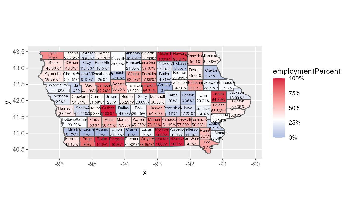
For complete control over the colorspace, you can use the scale_fill_gradientn function and specify the colors and values arguments.
mapPlot +
  scale_fill_gradientn(colours = c("#005DAB","#2A6EBB","white","#D81E3F","#C41230"),
                       values = c(0,.15,.305,.65,1), #colours & values come in pairs
                       na.value = "grey50",
                       labels = scales::percent,
                       limits = c(0,1),
                       breaks = c(0,.25,.5,.75,1))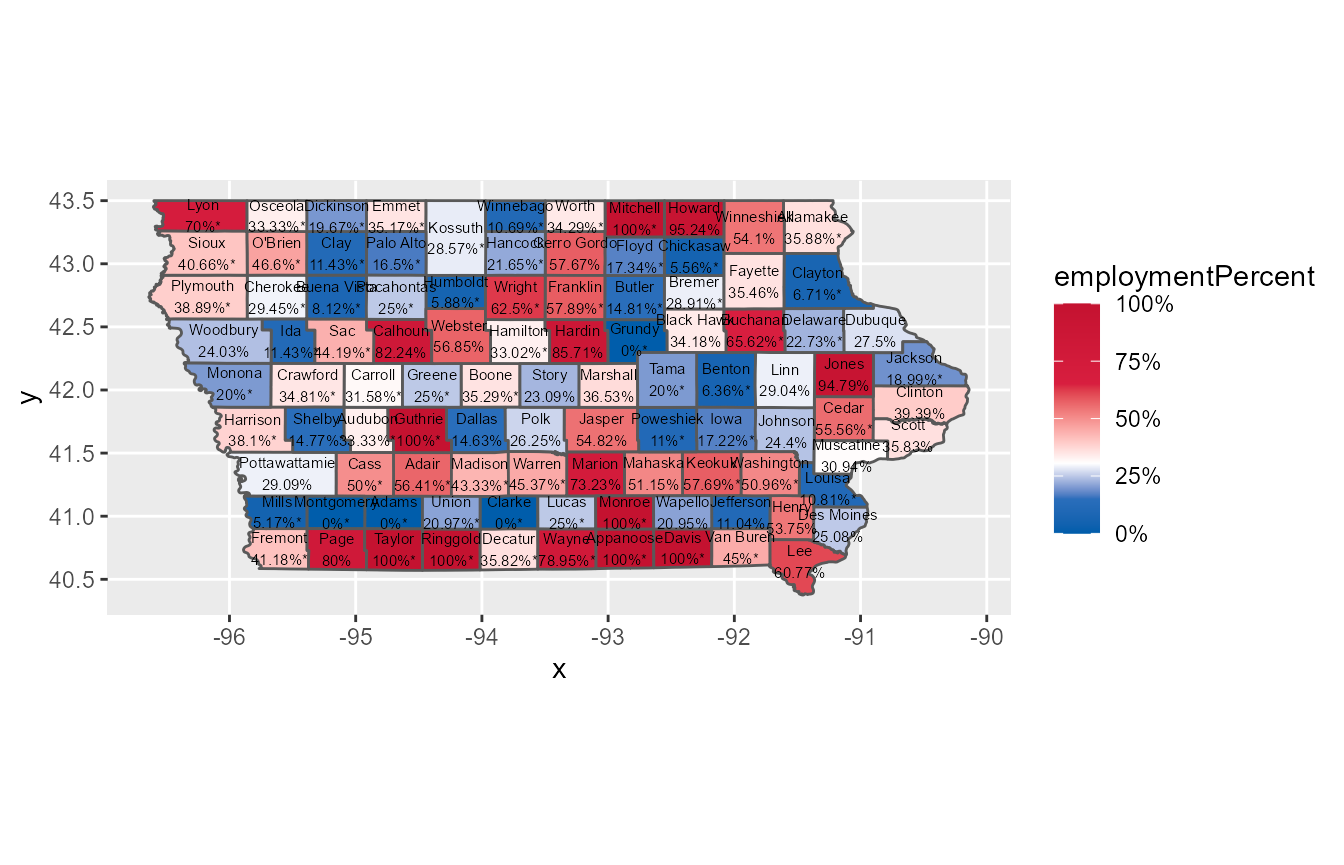
Note that there are scale_colour_gradient variants for these 3 functions as well. Use these when mapping a continuous variable to the color aesthetic as opposed to fill.
scale_*_manual
For categorical variables (e.g., sex, age group, employment status), you may want to manually set the aesthethics. For example, in the time series plot created above we may want to manually set the color, fill, and linetype for the different employment status groups. The scale_*_manual family of functions accomplishes this.
The aesthetics argument in scale_colour_manual allows us to map both fill and colour to same colorscale. Note that the colors are assigned to the different levels of employmentStatus in the order assumed by ggplot2 (which, for strings, is alphabetical starting at the beginning of the string). You can change this order by making the employmentStatus variable a factor and specifying the levels argument.
timeSeriesPlot +
  scale_colour_manual(values = c("#2A6EBB","#D81E3F","grey50","grey0"),
                      aesthetics = c("fill","colour")) +
  scale_linetype_manual(values = c("solid","dashed","dotted","dotdash"))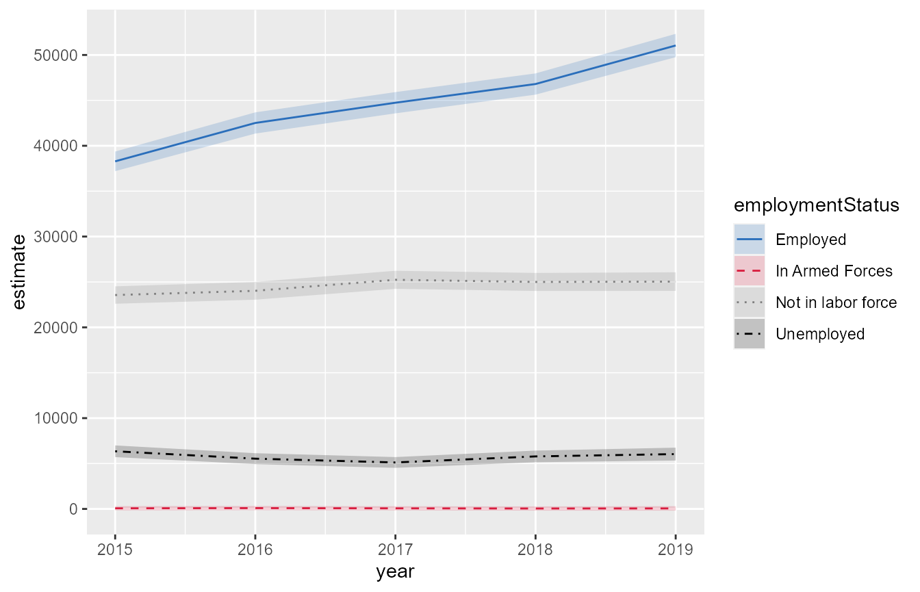
You can use the scale_*_manual to set any aesthetic mapped to by a categorical variable (e.g., shape, size, alpha).
The colorspace package
There are many R packages for specifying more diverse color schemes. The colorspace package is one such package.
A series of colorspace functions allow you to transform a given color palette into lighter (lighten), darker (darken), or grayscale (desaturate) versions of the same palette. The example below shows how to use lighten together with scale_fill_gradientn.
mapPlot +
  scale_fill_gradientn(colours = colorspace::lighten(c("#005DAB","#2A6EBB","white","#D81E3F","#C41230")),
                       values = c(0,.15,.305,.65,1), #colours & values come in pairs
                       na.value = "grey50",
                       labels = scales::percent,
                       limits = c(0,1),
                       breaks = c(0,.25,.5,.75,1))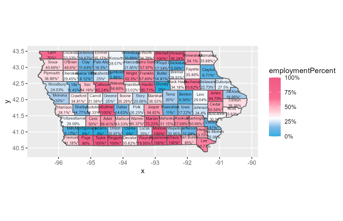
The colorspace package has two functions, choose_color and choose_palette, that will launch an app allowing the user to explore different colors/palettes and how they look when used in various types of plots (heatmaps, scatterplots, etc.). There is a ton of additional functionality not discussed here.
colorspace::choose_color()

colorspace::choose_palette()
Fonts
You can change textual elements of a ggplot using the theme function. An example is shown below. Note that this is purely for illustration – we wouldn’t actually want to put this particular plot in a final deliverable.
barPlot +
  labs(title = "Estimated Employment Status Counts by\nAge Group",
       subtitle = "African Americans in 2019",
       caption = "Source: 2019 5-year ACS survey") +
  theme(axis.title = element_text(family = "sans",size = 14),
        axis.text.x = element_text(family = "sans",size = 12,vjust = 1,hjust = 1,angle = 30),
        axis.text.y = element_text(family = "sans",size = 12),
        legend.title = element_text(family = "sans",size = 14),
        legend.text = element_text(family = "sans",size = 12),
        title = element_text(family = "sans",face = "bold",size = 12),
        plot.subtitle = element_text(family = "sans",face = "italic",size = 11),
        plot.caption = element_text(family = "sans",face = "plain"))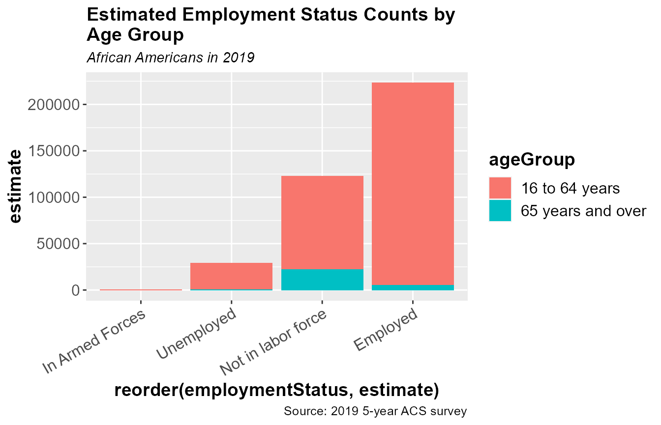
See this article for more information on ggplot2 fonts.
The ggplot panel
The ggplot panel contains the actual data visualization. By default, the panel has a gray background with white grid lines. Since the x-axis of the bar plot isn’t a numerical variable, we don’t really need to include the vertical grid lines. We may also want to remove the “minor” grid lines on the y-axis. The element_blank function can be used within theme to remove certain features of a plot.
barPlot +
  theme(panel.background = element_rect(colour = "black",fill = "white"),
        panel.grid.major.x = element_blank(),
        panel.grid.minor.x = element_blank(),
        panel.grid.major.y = element_line(colour = "grey70",size = .5),
        panel.grid.minor.y = element_blank())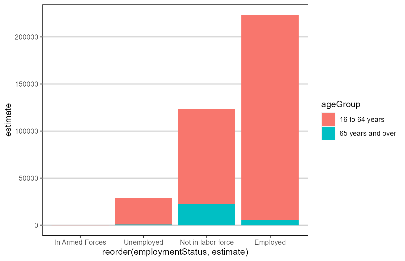
Change background color, grid lines, x & y limits, coord_*
Coordinate systems
The family of coord_* functions allow us to specify the coordinate system and range displayed in the panel.
coord_flip allows us to swap the x and y axes. Note the usage of expand = FALSE, which forces the bounds of the panel to align exactly with the data.
barPlot +
  coord_flip(expand = FALSE)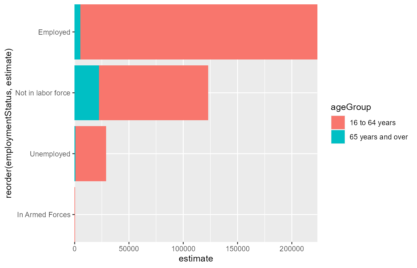
coord_cartesian allows us to “crop” a ggplot to a desired range of x and y-values. For example, the call below crops the plot down to only those values that are 20,000 and greater in 2016 to 2018. The use of NA in the ylim argument allows ggplot2 to pick the upper limit of the panel.
timeSeriesPlot +
  coord_cartesian(xlim = c(2016,2018),
                  ylim = c(20000,NA))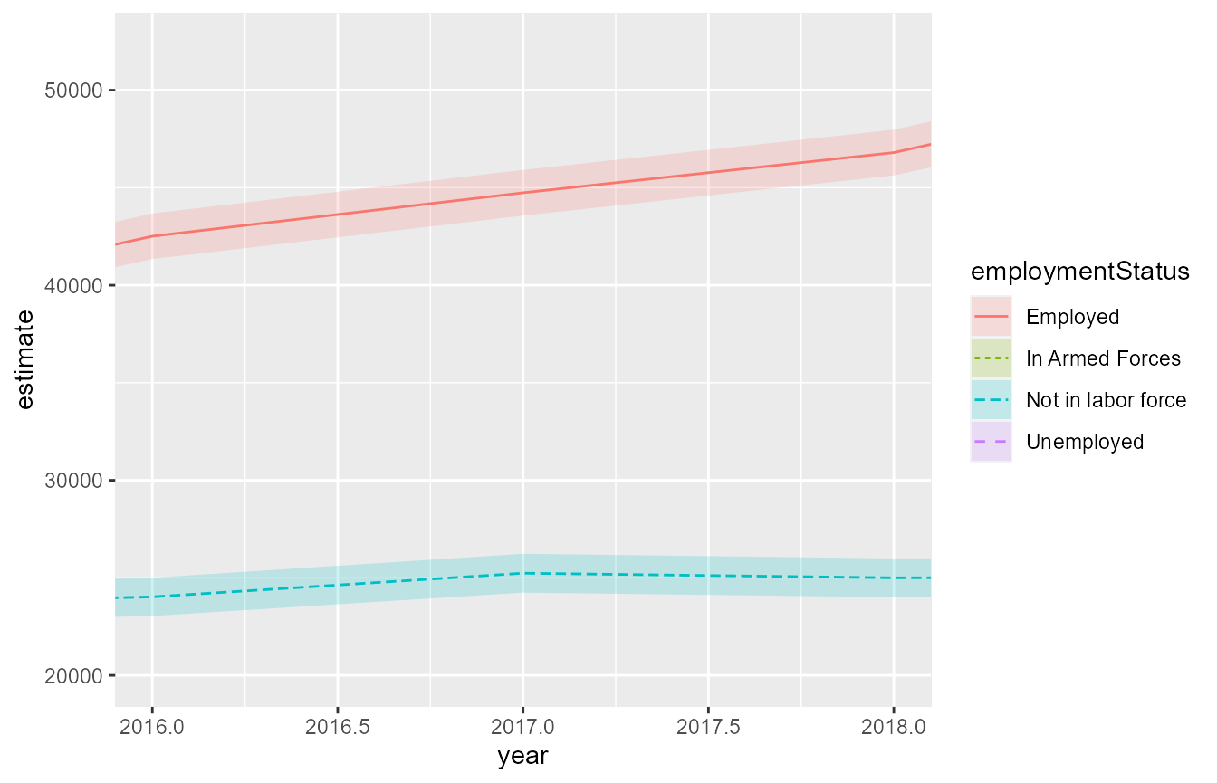
By default, ggplot2 will plot the x and y axes on their own scales. coord_fixed forces the axes to be plotted by a set ratio. We can thus make plots dynamically skinnier/wider without changing the underlying data.
timeSeriesPlot +
  coord_fixed(ratio = 1/5000)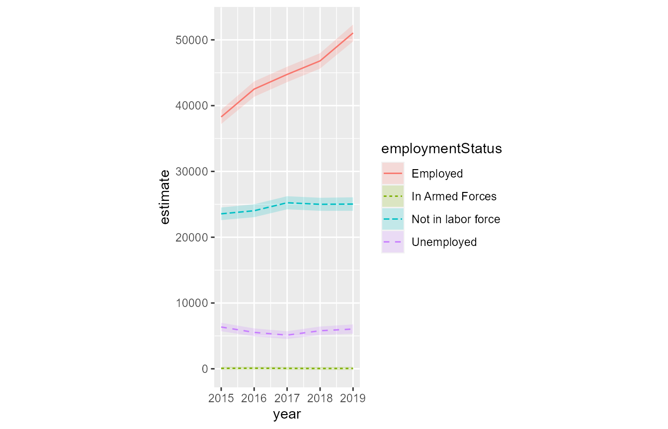
scale_x_ and scale_y_*
There are various functions to change the scale of the x or y axes.
The scale_y_continuous function includes a labels argument allowing us to change the y-axis text.
timeSeriesPlot +
  scale_y_continuous(name = "Estimated Count",
                     labels = scales::comma,
                     limits = c(0,55000),
                     breaks = c(0,10000,20000,30000,40000,50000))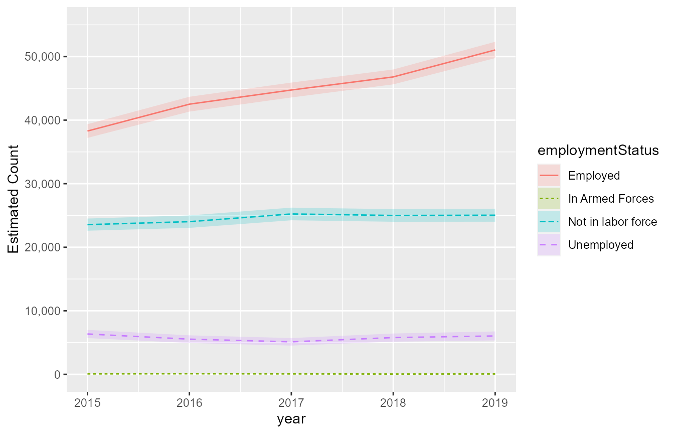
we can also transform the y-axis to a different scale since the estimates between employment status groups differ considerably. Square-root works for non-negative data.
timeSeriesPlot +
  scale_y_sqrt(name = "Estimated Count",
               labels = scales::comma,
               limits = c(0,55000),
               breaks = c(0,10000,20000,30000,40000,50000))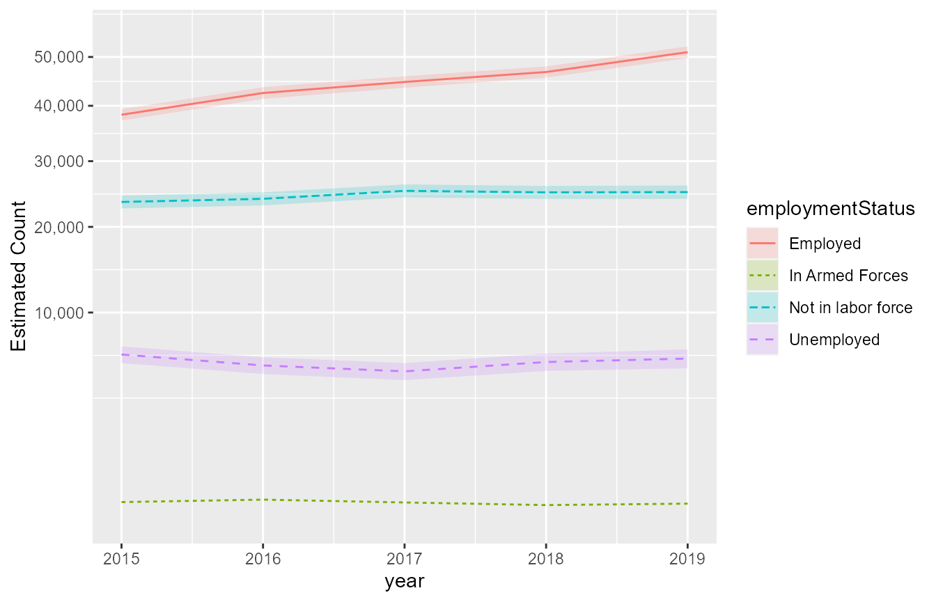
annotate
The ggplot2::annotate function allows us to add text to the ggplot panel without specifying an aesthetic mapping. Note the difference between a “text” and “label” geom. Specifying fill = NA will make the background of a label transparent.
barPlot +
  annotate(geom = "text",x = 1,y = 20000,label = "This is small\ntext",colour = "red",size = 3) +
  annotate(geom = "label",x = 2,y = 50000,label = "This is a\nlabel",fill = NA,fontface = "bold")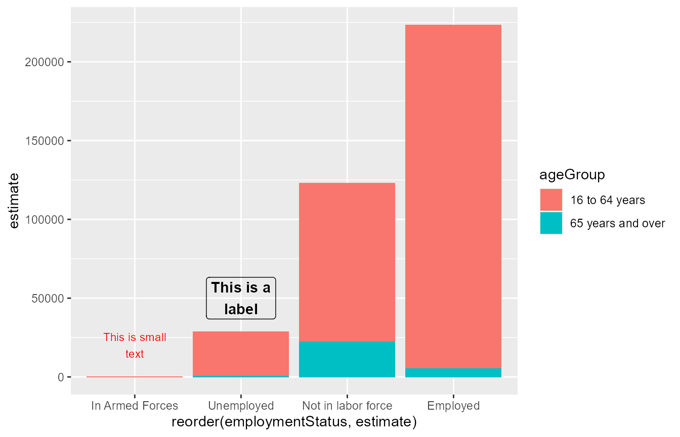
Legend
We’ve already seen how we can use the theme and element_text functions to change the legend font. The theme function also allows us to change features of the legend itself. The guides function allows us to change features of a particular key.
mapPlot +
  theme(legend.background = element_rect(colour = "white",
                                         fill = "white"),
        legend.position = "bottom") +
  guides(fill = guide_colourbar(title.position = "right",
                                label.position = "top",
                                barwidth = 10,
                                frame.colour = "black",
                                ticks.colour = "black"))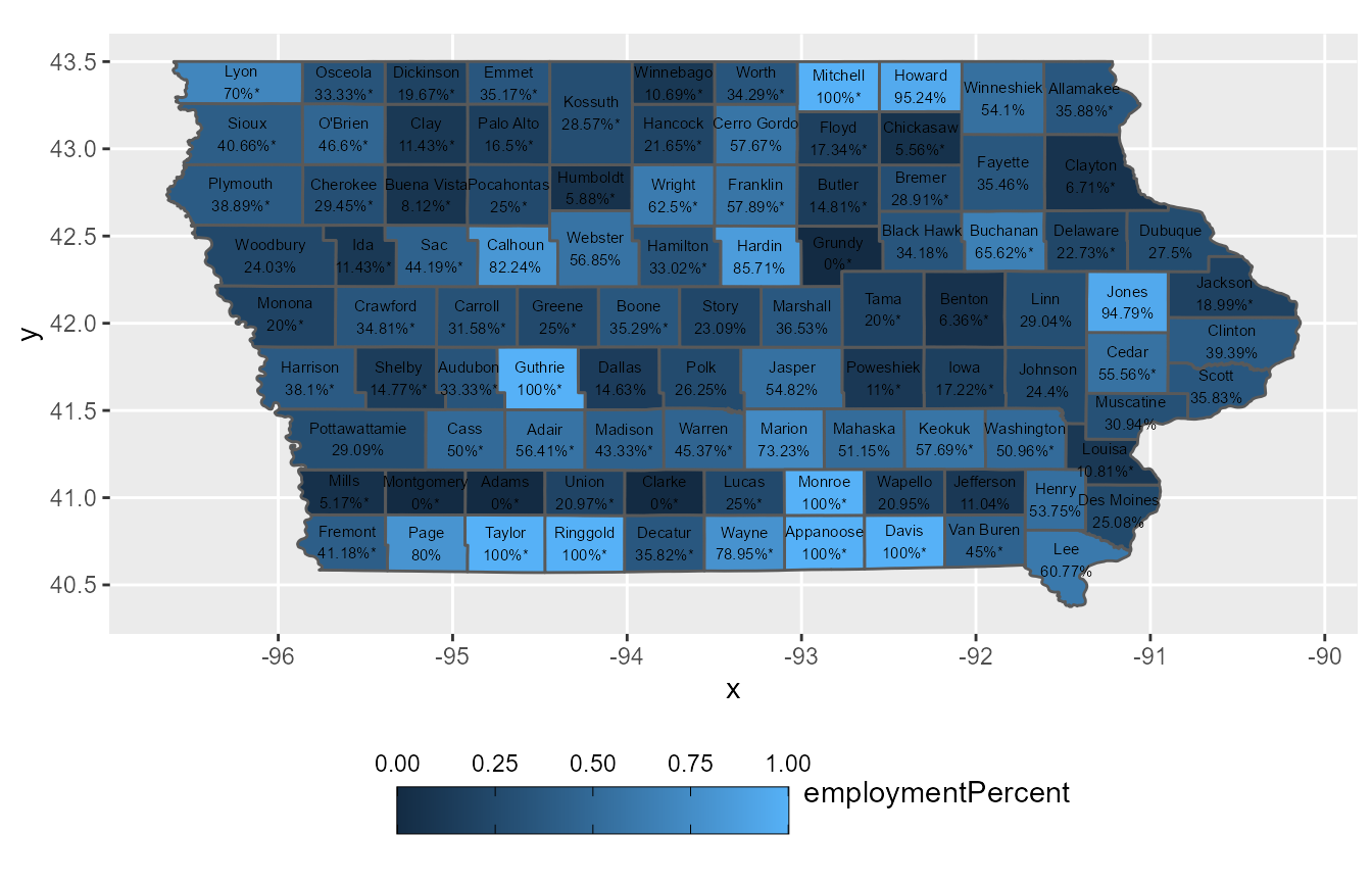
A quick way to remove a legend from a ggplot is using the legend.position argument in theme.
mapPlot +
  theme(legend.position = "none")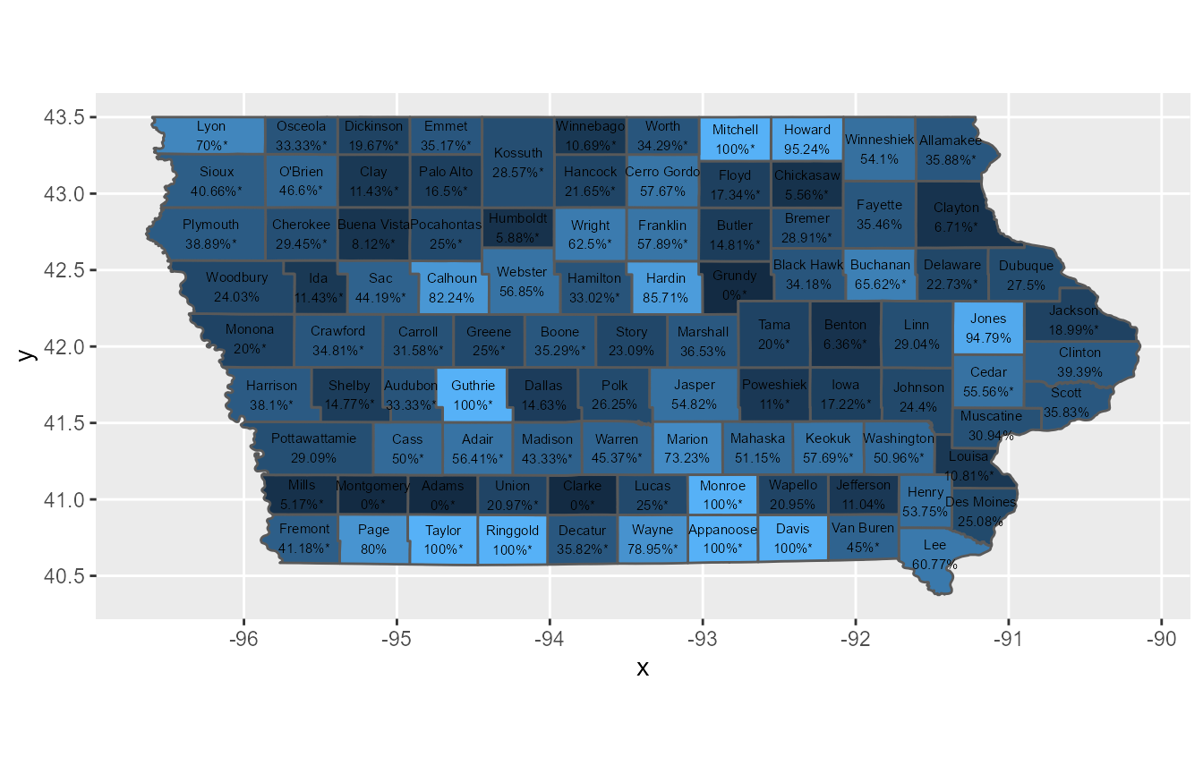
See this article for more information on ggplot2 legends.
cowplot::get_legend
The cowplot package extends the functionality of ggplot2 in many ways. A useful function in cowplot is the get_legend function. This allows us to extract the legend from a ggplot. For example, this is useful when we want to show multiple plots together that use the same aesthetic mapping, yet only want to show the legend once. As a precursor for the content below, the plot_grid function allows us to put multiple ggplot objects together.
mapPlotLegend <- cowplot::get_legend(mapPlot)

cowplot::plot_grid(mapPlot +
                     theme(legend.position = "none"),
                   mapPlotLegend,
                   nrow = 1)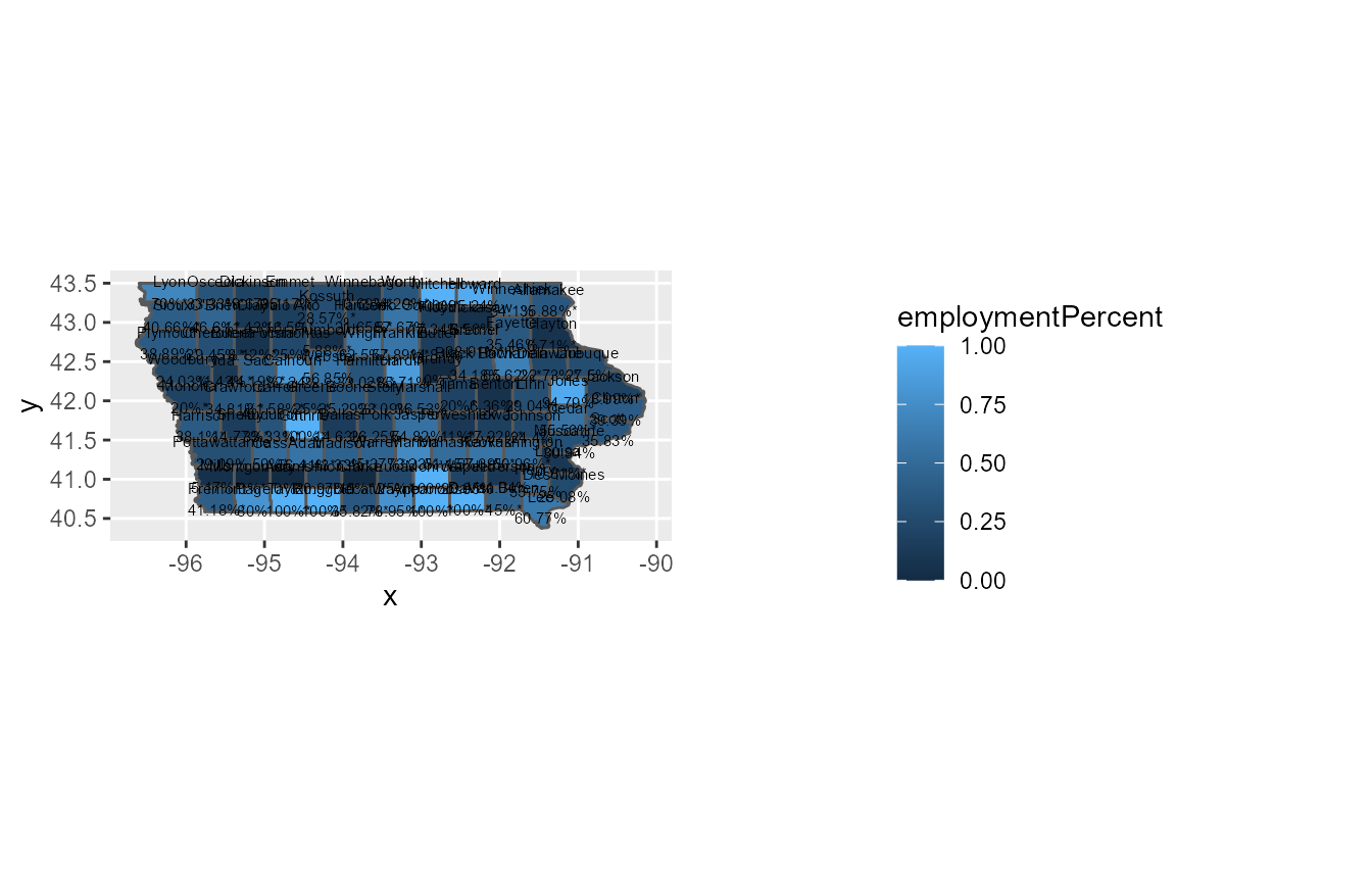
Combining multiple ggplots
Faceted plots
We can “facet” a plot by a categorical variable to replicate the same type of plot across different groups in our data. Note the effect of scales = free. Specification of this argument is strongly cautioned as the average lay person will likely not pay close attention to the axes’ scales. Similar to changing other ggplot text, we can use the theme function to change the facet titles.
barPlot +
  facet_wrap(~ ageGroup,
             ncol = 2,
             scales = "free") +
  theme(strip.background = element_rect(fill = NA,colour = "black"),
        strip.text = element_text(family = "sans",size = 10))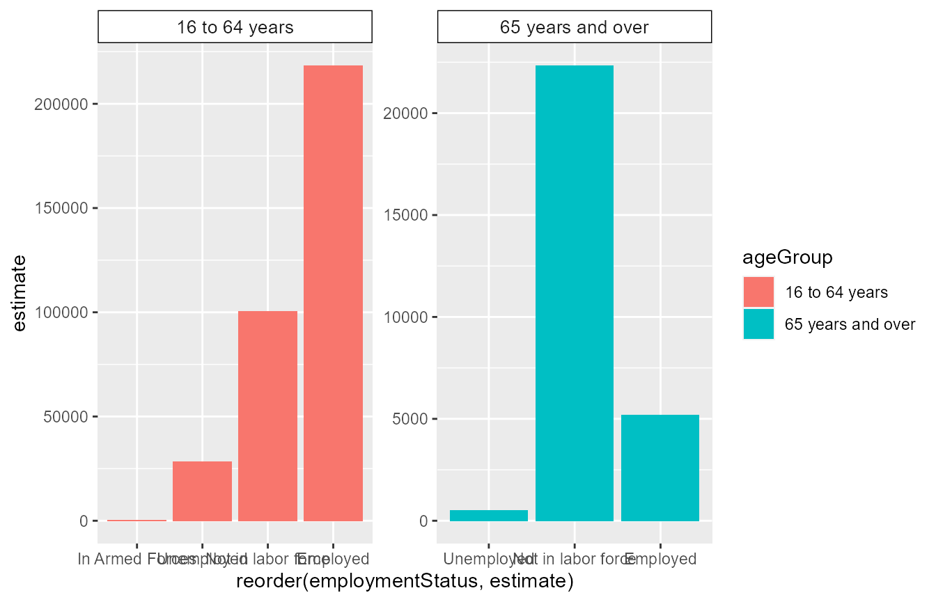
The patchwork package
While faceting works well to replicate the same plot type across different groups in a data set, we may want to combine different plot types together into the same object. There are many R packages that allow for combining R plots into a single object. We have already seen the usage of the cowplot::plot_grid function. The patchwork is a relatively recent package that is quite intuitive to use.
After loading patchwork, we can “add” to ggplots together by using the + operator.
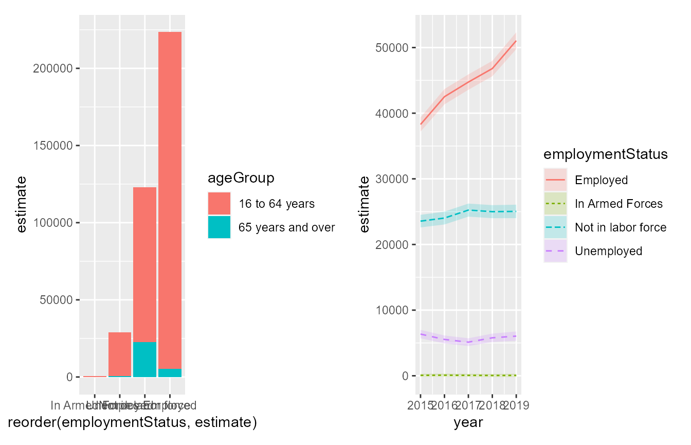
Note that the + operator will allow start a new line if 4 or more plots are combined whereas the | operator will keep all plots side-by-side.
We can also “stack” two plots by using the / operator.
barPlot / timeSeriesPlot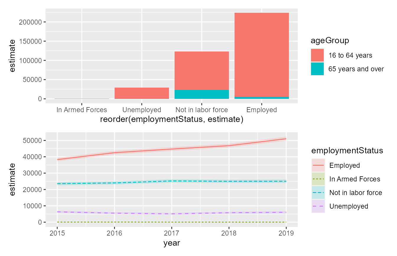
patchwork even obeys an “order of operations.” For example, consider the two plots created below.
(barPlot + barPlot) / timeSeriesPlot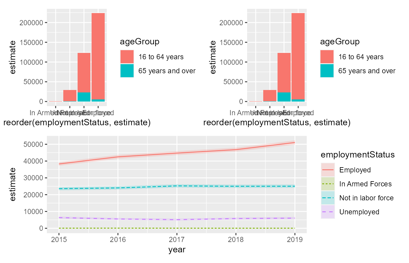
barPlot + (barPlot / timeSeriesPlot)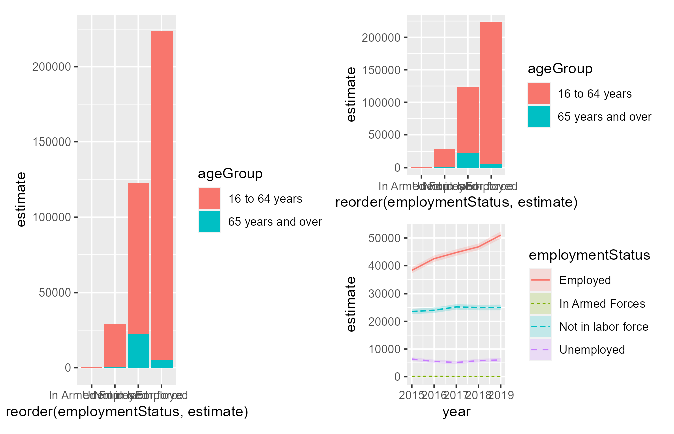
There is quite a bit of additional functionality in patchwork. For example, see the article on collecting all legends in one place and removing duplicates.
Exporting ggplots
The easiest way to export a ggplot to a desired image type is using the ggplot2::ggsave function. If you have assigned your ggplot object to a variable (for example barPlot created above), then you can pass this object to the plot argument. You can experiment with saving the plot at different heights/widths to determine what looks best on the poster. In the example below, the barPlot plot is saved as 11 x 8.5 inches (standard printer paper size).
ggsave(plot = barPlot,filename = "filename.png",width = 11,height = 8.5,units = "in")It is recommended that you save a plot to be larger than necessary (after fixing a height x width ratio) as we can always shrink the size of the plot once we copy it into the poster. Note that you may need to fiddle with the font sizes (see the how-to section above) if you decide to shrink the plot so that the text is still legible.